Overview
P&G’s goal is to be a leader in the area of inclusive package design for its products. Touching and improving lives is not just a slogan for P&G and its people; it’s a core belief that they all share. With this in mind, P&G is continually working to enable inclusive packaging design into its portfolios to further improve its consumers’ lives.
Fast facts
- P&G serves nearly 5 billion people around the world, with a strong portfolio of trusted, quality, leadership brands. The P&G community is made up of 99,000 employees in approximately 70 countries worldwide.
- It is estimated that 10% of all adults in the US have a visual impairment, for whom simple tasks, such as differentiating between personal care products during use, can be incredibly difficult.
- The National Federation of the Blind reports that there is a ‘Braille literacy crisis’ in the United States. Fewer than 10% of those who are registered legally blind in the US are Braille readers, and just 10% of blind children are learning to read the tactile writing system.
Project background
As one of the world’s largest and most trusted suppliers of consumer and personal care products Procter and Gamble (P&G™) recognises the importance of making sure that products and services can be used and enjoyed by everyone.
Simple tasks can be a real challenge for those living with a visual impairment, like telling the difference between personal care products, such as bottles of shampoo and conditioner. Even for consumers with poor or reduced sight, it can be difficult to identify products while in the shower or bath – where sight aids, such as glasses, contact lenses, or magnifiers, are not typically used. P&G recognised this issue and set out to find a solution.
“Most shampoo and conditioner bottles are designed to look and feel the same,” says P&G’s Special Consultant for Inclusive Design, Sumaira Latif, who is registered blind herself. “We realised that we have a huge opportunity to improve the lives of those with a visual impairment by changing our products and packaging, and encouraging other businesses to do the same.”

“It may seem like a small thing, but there are hundreds of these little things that visually impaired people like myself have to spend time checking and rechecking each day,” continues Latif. “If you want to be independent, if you want to be confident, you don’t want to be asking your brother, your mother, your sister, your husband, your children ‘What bottle is this?’ especially in such a private location as a shower.”
Using Braille may seem like a solution here, but Latif recognised that a very limited number of people who are blind or visually impaired are Braille users.
“Most people with visual impairments cannot read Braille – it takes months, if not years to learn, and really you have to start young to develop the sensitivity. Most people develop visual impairments in later life, and Braille is no longer an option,” says Latif. “It was important that we invent a feature which could be universally recognised and would work for people who haven’t had the opportunity to learn Braille.”
By choosing a simple, more universal approach to differentiate the bottles, P&G hopes to make the bottle more accessible, not just to those with a visual impairment, but for anyone who may struggle to tell the products apart during use.
Herbal Essences™ bio:renew™
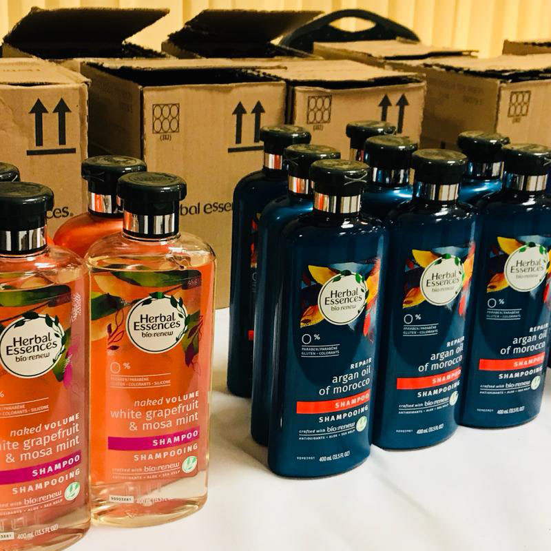
With her colleagues at P&G, Latif came up with the innovative idea of including tactile notches on the bottles to enable them to be easily differentiated by touch. P&G set out to experiment with a new tactile-coded design for the Herbal Essences bio:renew line of shampoos and conditioners.
“We want to help the world see with their hands,” explains Latif. “A simple differentiator doesn’t just help people with low or no vision, it also helps people who don’t have English as a first language, or those who normally wear corrective glasses or contact lenses – you would be surprised by the number the number of able-bodied, sighted people who tell me that they mix up shampoo and conditioner in the shower.”
“It only took a couple of conversations with Sam, and watching a couple of videos of our consumers who struggle to identify products to go from ‘Why would we do this?’ to ‘Why haven’t we done this?’” adds Kevin Higgins, Engineer at P&G.
First steps
To keep design costs and production impacts to a minimum, Latif and her P&G colleagues sought a solution capable of putting tactile markers onto its existing bottles, rather than creating the bottles with the markers already in place. Using a laser coder to etch the markers during production seemed like an optimal solution, however the team knew there would be complexities involved in marking the bottles without compromising the packaging or significantly impacting production time.
“While the objective is clearly worthy, we recognised that to be successful, the new approach must not impact productivity. We process hundreds of bottles a minute on each bottling line; changing a manufacturing process is complicated when you’re dealing with those kinds of quantities,” says Latif. “We needed a solution which could fit into our existing production lines without making a significant impact to production line speeds.”
Partnership with Domino
“We approached several different coding and marking suppliers with the brief, and Domino stood out as the only supplier dedicated to working truly collaboratively with us to find the most appropriate design and solution for creating the markers,” says Kevin Higgins. “It started out as a pretty daunting task – we weren’t sure how we were going to execute it.”
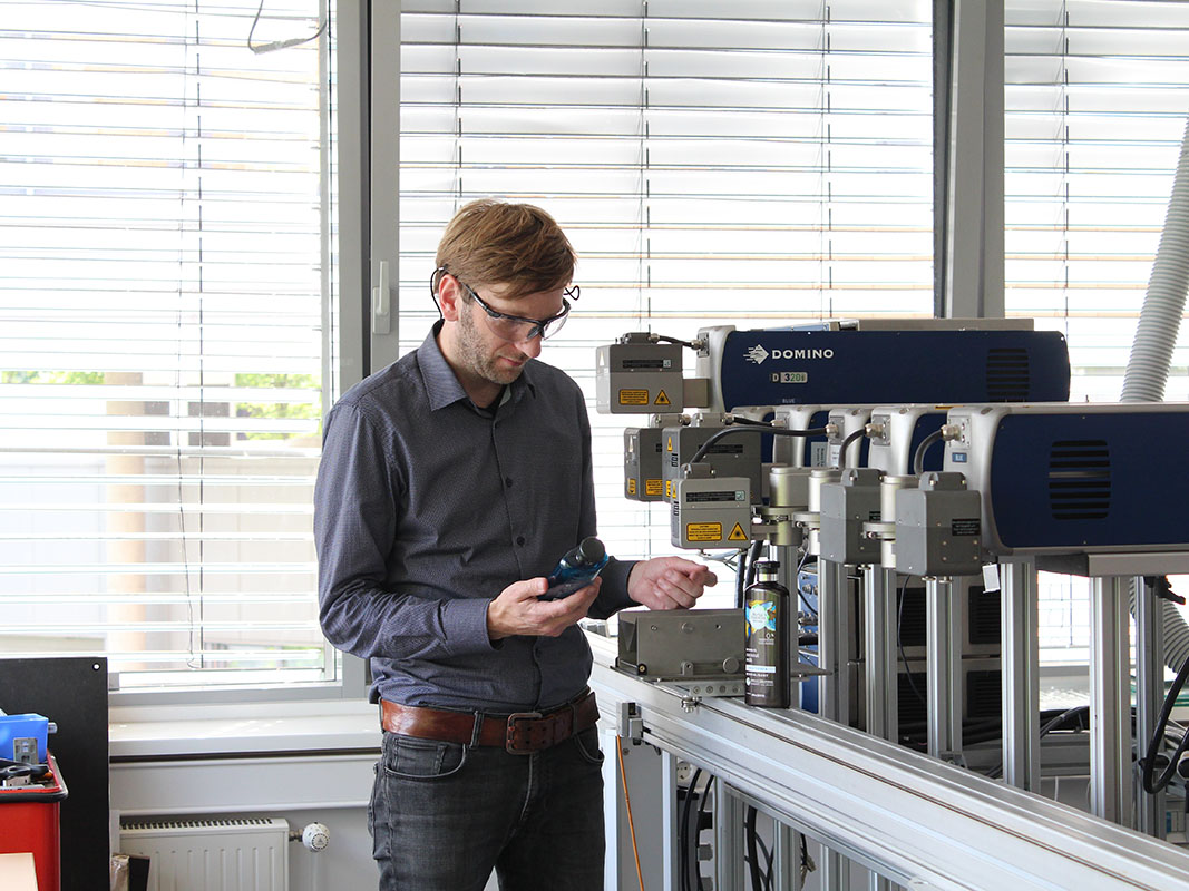
The decisive factor was Domino’s scientific expertise and highly collaborative and iterative design testing to uncover the best solution for the inclusive bottle design. The P&G team were invited to visit Domino’s specialist laser testing labs in Hamburg, initially to discuss the requirements for the project, and then again for a two-day working session to identify the best possible solution.
“We cast a net to multiple suppliers, Domino right away was the most engaged and the most interested in helping us move this idea along,” says Shane Mays, R&D Group Head, Fabric Care Packaging & Go-To-Market Delivery, P&G. “The engagement, the interaction, the questions, the support that I was getting right away is honestly something that I will never forget.”

“The initial request from Procter and Gamble, was they wanted to print a series of shapes and be able to feel them by touch. Sam said: ‘We have been given the impossible task, but we need to make it work,’” says Nitin Mistry, Global Account Manager, Domino.
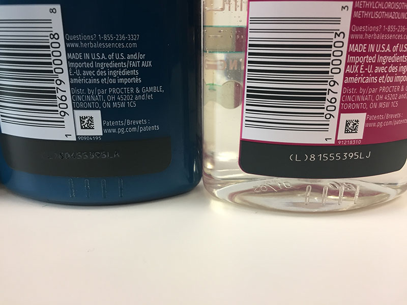
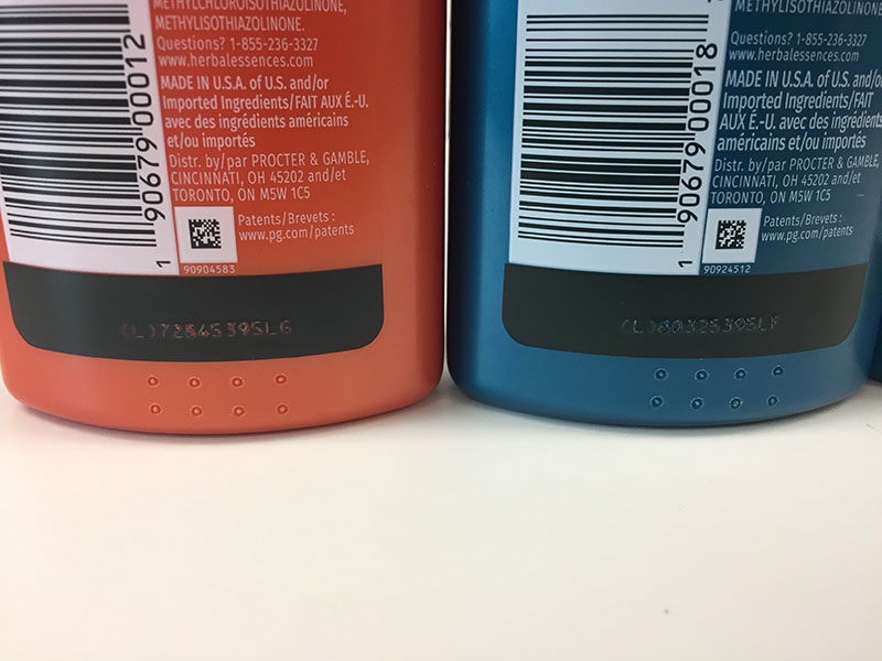
The chosen design features a row of raised lines on the bottom of the back of the shampoo bottles with two rows of raised dots in the same place on conditioner bottles.

The key to the project’s success was in ensuring that the laser did not puncture the bottles or weaken the barrier strength of the substrate. The Laser team identified the bottom of the bottle, where the plastic is at its thickest, as the best location for the tactile labelling, where it would be easily identifiable without compromising the integrity of the packaging.

Sample testing
In initial sample tests, Domino’s D-Series CO2 Laser coders confirmed the initial scientific analysis and were successful in etching the required vertical line and circle markers, leaving a tactile mark without compromising the substrate.
Domino’s Laser team used a 3D microscope to analyse the etching depth across nine different coloured PET bottles (the Herbal Essences bottle substrate) with two different coding modes: moving and stationary. The absorption rate of the coloured bottles was measured using an FT-IR spectrometer to ascertain whether there was a correlation between coding depth and plastic colour.
“We discovered that laser absorption at the tested wavelengths is independent of the colour of the bottle,” says says Dr. Stefan Stadler, Team Lead at the Laser Academy. “The same solution could be replicated using different coloured PET, which means that a wide range of product brands could adopt this, regardless of the colour of their bottles. This means that it could be an easy step for other manufacturers to follow P&G’s lead and adopt the same marking method.”
To ensure that the laser solution would not compromise the product packaging Domino’s Laser team spent more than a week testing the parameters of the laser to establish the most appropriate specifications. A 3D-profiling report detailing the testing process reassured the P&G team that introducing this additional labelling requirement would not affect the integrity of the product at any point during the supply chain.
“At P&G, our goal is to delight the consumer throughout the entire purchasing process. From first seeing the bottles on the shelf through squeezing out the last drop of product from the bottle, it is important that the consumer is delighted with his or her purchase throughout the process,” says Higgins.
“Bottle integrity is of the utmost importance to us because this is the first thing the consumer sees and the last thing they touch. The bottle not only has to look good, it also has to perform throughout its entire life and compromising its integrity was a concern for us. Through measurements and modelling, we were able to find parameters that not only delivered the tactile feel we wanted but also did not compromise our bottle integrity.”
“The experience working with Domino was fantastic. Throughout the whole process, it was a true partnership between P&G and Domino to enable this solution, that really gave us the confidence then to say ok, we can launch this in market, and not have any fear of giving an inferior product to our consumers.”
Validating the solution
To ensure the new stripes and circles approach would work for consumers, P&G presented the newly-coded Herbal Essences bio:renew bottles to the Royal National Institute of Blind People (RNIB) in the UK for consumer testing. A follow-up focus group with visually impaired consumers overwhelmingly approved of the new inclusive bottle design.
Following successful consumer feedback, P&G began using Domino’s laser solution to mark Herbal Essences bio:renew shampoo and conditioner bottles at various manufacturing plants in the US and at selected contract packers from January 2019.
The inclusive bottle design was a hit, receiving many positive reviews from the those living with partial or complete sight loss.
“Typically, with a bottle like this, I couldn’t even read what it was, so them to have the tactile feel on the bottom to know what it is, is really going to be life changing for a lot of people,” says Liz Lyons, Co-Owner, Focal Pointe Eye Care.
“To know that Procter and Gamble and Domino took the time to do this for someone like me, really means the world to me, and it helps me on a daily basis, and I just think it’s really awesome that companies are doing this,” says Jeff Wissel, Chief Accessibility Officer, Disability:IN
Active bloggers and spokespersons for the blind community have also shared their experiences online.
“I always have difficulty figuring out what I’m grabbing in the shower,” says Holly Bonner, Owner of BlindMotherhood.com. “These bottles are identical, but I don’t have to use a bump dot or a rubber band to differentiate what I’m going to be using… So, I think that this is an amazing idea.”
“While [P&G] are doing this with the visually impaired community in mind, this could also be great for little kids…[and]…people who are losing their vision later on in life…this is going to be very useful for them,” she continues.
“The best part about this whole thing is that a blind woman designed it. A blind woman who has worked for the company for 18 years designed it. So, it is not some sighted person that came up with this idea. This is somebody who is blind, who understands, who gets it. It’s amazing. I think that Herbal Essences has done a great job.”
Based on the success of the initial trial, P&G rolled out the new inclusive design across all its US range of Herbal Essences bio:renew shampoos and conditioners.
Driving industry change – P&G’s goal for the beauty industry
On 4th May 2020, Latif took part in a webinar hosted by the people behind BE MY EYES, an innovative web-based application for blind or visually impaired people, which enables users to be connected to volunteers via videocall who can assist with visual tasks. As part of the webinar Latif spoke about the challenges faced by blind and visually impaired people at home, and in the workplace, and how more companies are working to make their products accessible to those with disabilities – including P&G with their new coded bottles.
“I was happy to hear about the new-and-improved, tactile shampoo and conditioner bottles,” writes Blogger and BE MY EYES user Tia Wojciechowski, who sat in on the webinar.
“Almost all shampoos and conditioners are in matchy-matchy twin bottles. I guess people like it better that way, because it looks cuter in their bathrooms. Now there are bottles that are cute and tactile!” she continues.
“Herbal Essences…have added tactile lines on the backs of the bottles… Nothing that should inconvenience hair care product companies into spending a lot of extra money, and make them have to jack up the price.”
The long-term aim of P&G’s project is to encourage more manufacturers to create inclusive packaging designs for beauty and personal care products, which are often used by visually impaired consumers at times when they are unable to rely on glasses or contact lenses. The simple icon approach applied to Herbal Essences bio:renew could provide a global way of allowing differentiation, bringing freedom and confidence to millions of blind and visually impaired consumers in the US and elsewhere.
“This project I think is really just the catalyst sort of spark to really kick off the inclusive design for the company,” says Higgins.
Domino is here to support your needs and is capable of testing your specific products to provide recommendations for these markings. Domino welcomes visits to the Laser Academy and other advance testing facilities, to allow for better understanding of Domino technologies and their capabilities.
If you are interested in discussing how Domino’s laser coding solutions could be used to design inclusivity into your product packaging, or for any coding and marking requirements, please get in touch.