Domino Printing Sciences (Domino) has teamed up with Procter and Gamble (P&G) – one of the world’s largest and most trusted suppliers of consumer and personal care products – to develop an inclusive, tactile solution for product labelling, to help visually impaired consumers distinguish between personal care products during use.
For those living with a visual impairment, simple tasks, like telling the difference between bottles of shampoo and conditioner, can be a real challenge. Even for consumers with poor or reduced sight, it can be difficult to identify products while in the shower or bath – where sight aids, such as glasses, contact lenses, or magnifiers, are not typically used. P&G recognised this issue and set out to find a solution.
“Most shampoo and conditioner bottles are designed to look and feel the same,” says P&G’s Special Consultant for Inclusive Design, Sumaira Latif, who is registered blind herself. “We realised that we have a huge opportunity to improve our products and packaging, and to encourage other businesses to do the same.”
It was clear that Braille was not going to provide the easy differentiation needed, due to the very limited number of Braille users. For example, in the US less than 10% of people with the highest visual impairment - those registered as legally blind - can read the tactile writing system. P&G and Domino therefore sought to develop a more universal alternative that could make the bottles more accessible to anyone with partial or complete sight loss.
“We were invited to visit Domino’s specialist laser testing labs in Hamburg, initially to discuss the requirements for the project, and then again for a two-day working session to identify the best possible solution. Together, we chose the Herbal Essences bio:renew range of shampoo and conditioners as a trial product, which could be easily marked by Domino’s D-Series CO2 laser coders to create a differentiating tactile marker,” says Kevin Higgins, Engineer at P&G.
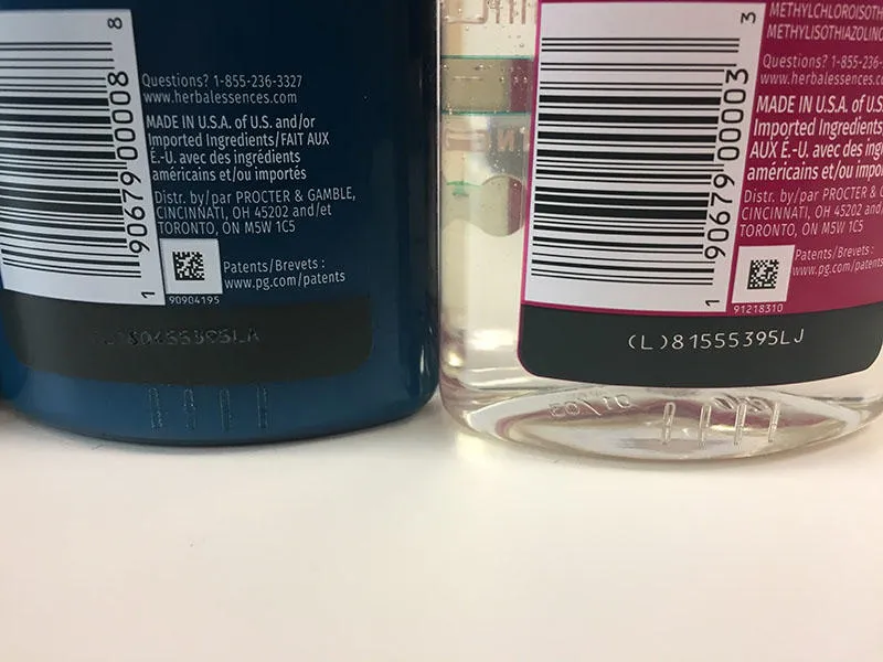
Dr. Stefan Stadler, Team Lead at the Laser Academy, led the collaborative task with Latif and her team to find the best approach. They identified the bottom of the bottle, where the plastic is at its thickest, as the best location for the coding, where it would be easily identifiable without compromising the integrity of the packaging.
“The chosen design features a row of raised lines on the bottom of the back of the shampoo bottles – “S” for shampoo, “S” for stripes – with two rows of raised dots in the same place on conditioner bottles – “C” for conditioner, “C” for circles,” says Stadler.
Bottle integrity was an important factor in P&G’s considerations because this outward embodiment of the brand is the first thing the consumer sees and the last thing they touch. The bottle not only has to look good, but it also has to perform throughout its entire life, so compromising its integrity would not be acceptable.
To ensure the new stripes and circles approach would work for consumers, P&G presented the newly-coded Herbal Essences bio:renew bottles to the Royal National Institute of Blind People (RNIB) in the UK for consumer testing. A follow-up focus group with visually impaired consumers overwhelmingly approved of the new inclusive bottle design, receiving many positive reviews from those living with partial or complete sight loss. Based on the success of the initial trial, P&G rolled out the new inclusive design across all its US range of Herbal Essences bio:renew shampoos and conditioners.
The long-term aim of P&G’s project is to encourage more manufacturers to create inclusive packaging designs for beauty and personal care products, which are often used by visually impaired consumers at times when they are unable to rely on glasses or contact lenses. The simple icon approach applied to Herbal Essences bio:renew could provide a global way of allowing differentiation, bringing freedom and confidence to millions of blind and visually impaired consumers in the US and elsewhere.
“We are really passionate about helping our customers to produce products which enrich the lives of consumers, and which can be used and enjoyed by everyone, regardless of their circumstances,” says Nitin Mistry, Global Account Manager at Domino. “As such, we are thrilled to have worked with P&G on this project and would welcome discussion with any other organisation who is looking to design inclusivity into their product packaging.”
Find out more about the P&G™ Chooses D-Series for Tactile Labelling on Shampoo and Conditioner case study.