Now vs Then
From tea to talcum powder to toasted corn flakes, the 1920s was a time when product packaging was incredibly simple. Packaging’s primary purpose was to hold its content, without it getting spoilt or damaged. Design was almost incidental. The technology to facilitate elaborate visual elements simply didn’t exist. Flash forward to today and print technology is so sophisticated that it’s possible to create packaging of complexity that was unimaginable a century ago. If you can visualise the design, there’s a good chance it can be printed. Anything goes. But is the trend toward elaborate packaging being slammed into reverse?
The land grab of the mind
The explosion of digital media has had severe impacts on consumer concentration spans. We feel bombarded because we are bombarded. Finite attention spans have never been competed for with such ferocity, from so many sources. It’s a land grab of the mind. As such consumers have never felt so busy and hectic and squeezed for time.
Reverting to vintage packaging, with all of its simplicity and clarity of message, may be a necessary antidote.
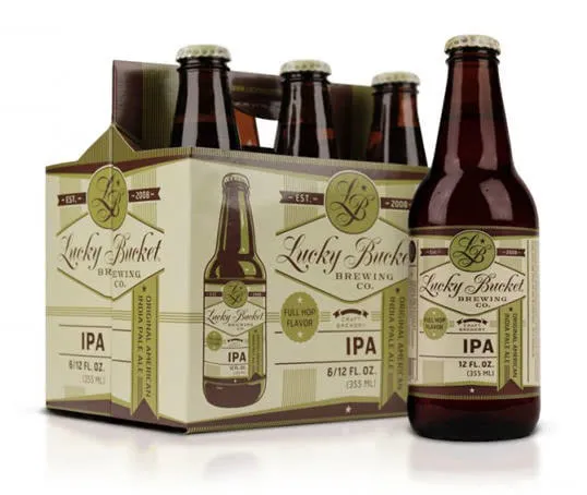
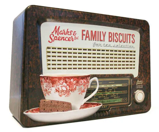
What defines the ‘new vintage’?
The emergence of ‘vintage’ packaging is not a rehash, but a reinterpretation; a reimagining of some of the design elements that made the packaging of the 1920s - 1950s so clear. The sophistication of today’s printing technology gives packaging designers the chance to be as nuanced as they wish. They articulate the inspiration that is being drawn from the packaging of yore.
What does it sound like?
People don’t have time to work out what your product is, what it does or whether it’s right for them. They want their needs met - and fast. The new vintage packaging must explain what the product is, why it’s good, how it fits consumer criteria. Increasingly this is done through copy: removing all but the non-essential elements to leave bold, clear messages. Simple typefaces, large font-size.
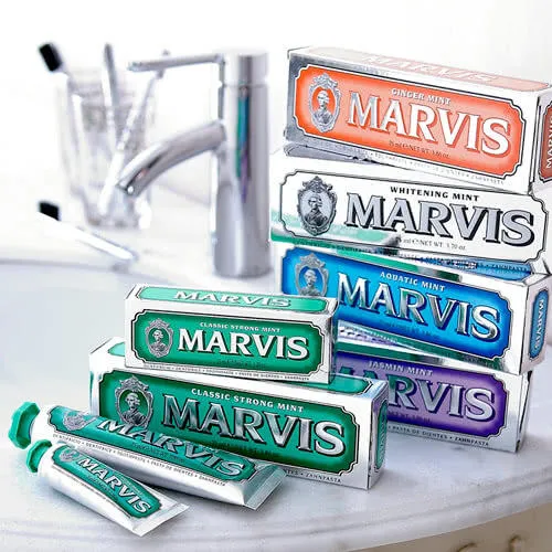
What does it look like?
Simplicity is the keyword from a visual perspective too. Block colours, two-tone and simple colour palettes are the order of the day. Simple shapes or the use of geometric patterns is another hallmark. Designers are also inserting plenty of negative space for design elements to breathe.
Less clutter, more clarity.
Aping the artisan
Key vintage design elements are enjoying a comeback as designers look back to go forward. Calligraphy, letterpress and foiling are increasingly used to make the mass-produced feel more authentic and artisanal. That’s crucial in an age when consumer faith in global brands can sometimes be sceptical...
To wrap up
Design trends come and go. That’s the economics of fashion. But there is a clear move towards packaging design that has more simplicity and clarity. It stands out on the shelf. It catches the eye. It gives designers a new opportunity to challenge and express themselves. But most importantly it obliges the needs of attention-poor, time-strapped consumers.
Simple packaging isn’t about dumbing down; it’s about wising up.
>> 5 food and drink packaging trends for 2016
>> Flexible packaging trends for 2016